
Color Psychology: What Your Home Colors Say About You
Walk into any house and notice the walls, the sofa, even the rug. Instantly, you get a feeling—calm, energetic, cozy, or dramatic. That’s the magic of home colors. And yes, psychologists, designers, and even contractors agree that choosing paint and finishes goes far beyond aesthetics. It’s about color psychology.
So if you’ve ever wondered why you’re drawn to sage green or why a bright yellow kitchen makes you feel jittery instead of cheerful, let’s decode what your home colors are really saying about you.
The Basics of Color Psychology in Homes

Here’s the quick breakdown: colors affect emotions. It’s why hospitals lean toward calming blues, while fast-food chains splash reds and yellows to trigger appetite and urgency.
When it comes to interiors, color psychology is a powerful tool that helps homeowners and DIYers design rooms that not only look stylish but also feel right.
What Different Home Colors Reveal About You
1. White – The Minimalist’s Dream
White walls = clean slate. People who love white often crave simplicity, clarity, and a sense of order. It’s no surprise that modern condos and Scandinavian-inspired homes lean heavily into white.
However, here’s the real tip: pure white can feel sterile in small rooms, so soften it with warm undertones, such as ivory, cream, or wood.
Color psychology: You value peace, neatness, and a clutter-free life.
2. Gray – The Balanced Thinker
Gray is the Switzerland of home colors. It's neutral, adaptable, and sophisticated. Homeowners who love gray often want flexibility. Their walls don’t steal the show, but they allow furniture, art, and rugs to really stand out.
Remember, cooler grays work better in sunlit rooms, while warmer grays keep dim areas from feeling cold.
Color Psychology: Gray personalities value balance, practicality, and understated elegance.
3. Blue – The Calm Planner
It’s no accident that blue is a global favorite for bedrooms and bathrooms. From sky blue to navy, this shade signals calm, order, and reliability.
DIYers painting small apartments often pick blue because it visually expands space and pairs well with metal and wood accents.
Color psychology: People who surround themselves with blue tend to be stable, dependable, and sometimes perfectionists.
4. Green – The Nature Lover
Green is balance in a can. It’s refreshing, revitalizing, and instantly brings the outdoors inside. Whether it’s sage, emerald, or olive, green is the go-to for homeowners who want calm energy.
Color psychology chart reveals: Green lovers value growth, balance, and connection to nature.
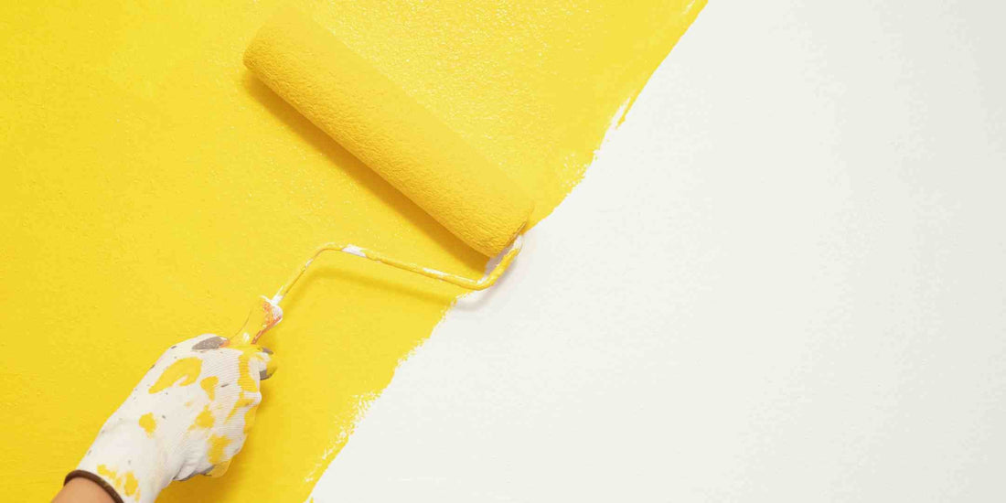
5. Yellow – The Optimist (or the Risk-Taker)
Yellow is tricky. Done right, it sparks joy. Done wrong, it feels like living inside a highlighter.
Small splashes—like an accent wall, dining chairs, or backsplash—are better than going all in. Those who choose yellow are usually adventurous, outgoing, and crave energy.
Color psychology: You’re cheerful, bold, and love taking risks. But you may need to balance that with neutrals like beige or gray to avoid overstimulation. For instance, a yellow accent wall in a room with predominantly neutral colors can add a pop of energy without overwhelming the space.
6. Red – The Bold Entertainer
Red in interiors is like espresso: intense, energizing, and not for the faint of heart. Think dining rooms painted in burgundy or living rooms with a deep red accent wall.
Designers use it to encourage conversation and appetite (hence, restaurants often opt for red). But too much can feel overwhelming in small condos.
Color psychology chart interpretation: Lovers of red are passionate, outgoing, and thrive in social settings.
7. Black – The Dramatic Visionary
Black walls? Trendy, yes. Intimidating, also yes. But when used wisely, black oozes sophistication.
Contractors often see homeowners scared of black until they see it paired with warm lighting, metallic accents, and textured décor. Then, it clicks: chic, moody, and modern.
Color psychology: Black signals confidence, mystery, and bold taste.
8. Beige & Earth Tones – The Comfort Seekers
Beige, taupe, and warm browns are the ultimate colors of comfort. Homeowners who choose them often crave stability, relaxation, and timelessness.
Families with young kids love beige because it hides dirt better than stark white while still looking clean.
Color psychology: You value comfort, tradition, and natural living.
How Contractors and DIYers Use Color Psychology
Understanding home colors isn’t just for interior designers. Contractors and DIY homeowners benefit from this knowledge, too.
- For contractors: It helps suggest paint palettes that align with clients’ personalities and lifestyles.
- For DIYers: It prevents the dreaded “paint regret” moment after spending weekends rolling on a color that just doesn’t feel right.
- For homeowners, it allows tailoring each room’s mood—cozy bedroom, lively kitchen, and calm home office.
Always compare your choices against a color psychology chart to see which emotions they evoke before making a decision. This practice will guide you in making informed color choices that align with your desired emotional and psychological effects.
The Role of Lighting and Finish
Colors don’t exist in isolation. Natural light, artificial bulbs, and even finishes (matte, satin, gloss) change how colors read.
Example: A navy wall under daylight feels crisp, but under warm bulbs at night, it shifts to cozy indigo. This is why paint testing is essential. Tape those swatches on walls and live with them for a few days. Also, consider the finish of the paint. A glossy finish can reflect more light, making a room feel brighter. In contrast, a matte finish can absorb light, creating a more intimate atmosphere.
Combining Colors: What Your Palette Says About You
- Monochromatic schemes: Suggest you value harmony and minimalism.
- Contrasting colors (blue + orange, green + pink): Show creativity and boldness.
- Neutral bases with pops of color: Signal balance—you like calm but still enjoy personality.
Interior designers love to remind clients: your color palette is your story, told through walls, fabrics, and décor.
Common Mistakes in Choosing Home Colors
- Ignoring undertones – A gray with purple undertones after beige furniture? Clash City.
- Overusing brights – Too much yellow or red can feel chaotic.
- Neglecting flow – Each room doesn’t need to match, but there should be a sense of cohesion.
Think of your house like chapters of a book. Different, but connected.
Expert Designer Tips
- Stick to 2–3 primary home colors for the entire house, then play with shades.
- Use darker tones for accents (doors, trims, cabinets) instead of full walls.
- Balance bold colors with plenty of neutrals.
- Don’t chase trends blindly—choose colors you’ll still love in five years.
One interior designer says:
“Clients often pick trendy shades they saw on Pinterest, but the happiest ones always go with colors that match their lifestyle, not just the trend cycle.”
So, What Do Your Home Colors Say About You?
The truth is, there’s no “right” color—only what feels right to you. But by understanding color psychology, you can be intentional. That’s how you design spaces that reflect your personality and make you feel good every single day.